
In the world of online marketing, if your website isn’t designed with a clear objective and call-to-action in mind, then you’ve just made a big mistake.
Whether you’re just looking to showcase your work, collect email information, or increase sales, either way, your CTA is crucial to your website’s success.
A lot of things go into a conversion. You need to have an attention-grabbing headline, seductive copy, and an overall site framework and sales funnel that is crafted to help you achieve your goals. However, out of all these things, the most powerful conversion tool is the CTA button.
In this article, we will go through the five steps necessary to design the strongest possible CTA button that will help you increase your conversions today.
Take a Look on Call To Action Examples In Writing
Step 1: Contrast and Color
One of the biggest obstacles that stand between a site visitor and a conversion is whether he will even see the button. Many designers will choose the color of a button based on its looks. Although there is nothing wrong with choosing something that looks aesthetically pleasing, the problem is when the choice of color does not deliver the results you desire. One of the biggest problems with this approach is when the CTA button looks good, but blends in with the page.
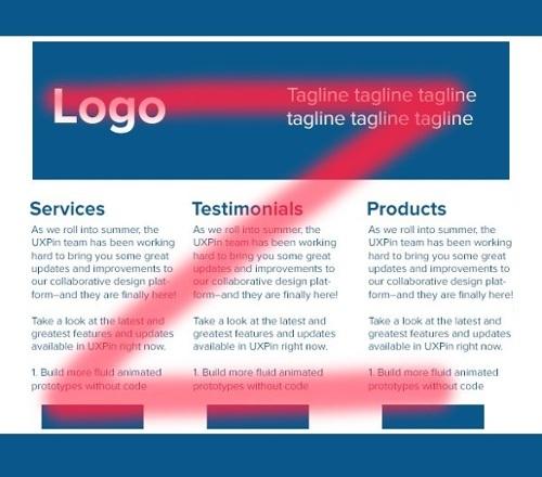
Take this landing page for instance:
Do you think the CTA stands out in any way? You probably had to look for it, which is a very bad sign. That’s because it’s the same color as the other things located within the form field. As a matter of fact, it even seems as if the designer was purposefully trying to blend the button with the form itself. In this case, it was a bad idea, especially since they were trying to get more clicks and conversions to their website.
In general, you want to make your CTA stand out for the end user. In theory, any color can work, as long as it grabs your potential customer’s attention. However, bright colors have been proven to work best, (especially if the rest of your page is composed of a neutral color.)
You will also need to think about your target audience. Different groups of people respond better to different colors. If your web audience is composed of men ages 45 and above, you’ll probably get better conversions using blue, instead of a lighter tone of magenta. If your site caters to children, then you might want to use primary colors.
Contrast is Crucial
The color you select should also depend on the other colors of your web page. The last thing you want is for your CTA button to go unnoticed, so make sure it stands out.
Also, be sure to stay away from colors that pair up in the color wheel. For example, if your page background is blue, you’ll be better off using a yellow button as opposed to a green one.
If your background is dark, use a lighter button. If your page is light, use a dark button.
One of my favorite strategies is building a web page through a monochromatic color scheme, with a bright CTA button (as you can see in the Nike example below.) This results into a page that stands out, is easy on the eyes, and allows your audience to not only understand your benefits, but be sucked into your irresistible CTA a well.
Step 2: Placement
Another factor which will determine your CTA button’s success is its location within your web page. We all know it should be placed somewhere that stands out, but where is that anyways?
Your CTA button must be placed directly in your user’s path, or it runs the risk of not even being seen. You need to think strategically and place it where your user will look next (ideally right after they’ve been persuaded by your offer.)
Luckily, there is however, a science to this. Most users on any given website take one of two paths within a web page: either the Z-Pattern or the F Pattern.
Z Pattern
Your eyes usually move in the direction shown below on websites that have a bunch of graphics or lots of texts with white space. As you may notice, it forms the shape of a Z, and ideally, you’d want to put your CTA within that path, preferably towards the end, where your eye stops.
F Pattern
On websites that have more text than graphics and images, people tend to look at the page through an F pattern. They go from left to right, down, and repeat the process. One these pages, it’s best if you put your CTA all the way to the right. That’s where the eye will stop before moving down to the bottom line.

In a Single Column
No matter if your web page is a Z or F pattern, a lot of times, it helps to place your CTA button below an attention-grabbing headline, within a single column, with a lot of whitespace around it.
Like this for example:

Step 3: Make Sure It Looks Like a Button
Your website can look amazing. Your sales copy can be extremely persuasive. And you can even be a landing page master. But if your CTA doesn’t look like a button, then no one is going to click on it.
We said it earlier and we’ll say it again: don’t let your button blend in. Make it stand out.
Do you remember last year’s ghost button trend? Those simple, elegant, and good looking buttons? The problem with them was that although they looked pretty, nobody clicked on them.

They look more like a text box, right? This specific design is a prime example we can learn from. You need to make sure your buttons look like buttons.
Here’s some food for thought.
↣ Make sure they are filled in with a solid color
↣ Add a subtle drop shadow
↣ Add a hover effect
↣ Add a mouse-over effect with visual feedback that says “click here”
Step 4: Round Those Corners
We have associated buttons with rectangles. Let’s not reinvent the wheel. Don’t try to create cute little shapes, as they’ll only confuse your visitors.
According to designer Paul Olyslager, rectangles with rounded corners work best, since they point towards and draw attention to a button.
Step 5: Powerful Copy
Now that we know what our button should look like, it’s time to write out the copy. First, you have to speak your audience’s language. Use words that they use, and speak the way they speak. Here are some tips to write persuasive copy for your CTA button:
↣ Make it fun to read. The word “explore” is much appealing than “see”.
↣ Show the good side, never the bad one. Take the word “buy” for example. It reinforces that a prospect has to give up money. The word “schedule” sounds like a commitment, constraint, and downright hassle. More positive words such as “play”, “find”, or “get” sound much better from a psychological point of view.
↣ Make it specific. Don’t cast any doubts. Your copy should let the user know exactly what will happen once they click on your button. A generic CTA such as “click here” can mean a lot of different things. Something more specific such as “show my results” goes straight to the point.
↣ KiSS – Keep it short and sweet. 2-4 words are all you need to get your message across clearly.
Final Thoughts
Your CTA button is one of the most important things on your website. Not only does it need to stand out, but it needs to be enticing too. While you can achieve better results by modifying your copy or other content, at the end of the day, your button is the biggest influencer.
If you use the tips described in this article and apply it to your website in a way that is logical, you can expect to see a positive increase in conversions in less than 24 hours. By adjusting your copy, and changing the color and size of your button, you will be able to reach peak performance in your conversions in no time.

